Context
Inicio’s promise is to identify the best locations for solar power plants using Eywa, our in-house algorithm. While there is an increasing need to develop Europe renewable energy production, finding places where this activity is compatible with the local contraints is not easy.
This is especially true for Inicio where we aim at finding medium to large scale projects that will respect and bring synergies to the local agricultural activity. We hence need to follow numerous and strict conditions to avoid disrupting the surrounding area. They can be related to town planning, agricultural planing, protected areas, etc… One of them is visibility from close housing and historical monuments.
Since this is a hard constraint, as a solar power plant developer you will aim to identify this risk as soon as possible when looking for the perfect place. Ideally in the early phases of your research and before having to go on the field. But how can you do that without seeing the surrounding area by yourself?
Visibility contraints are painful
Most of the solar project developers are using tools like Google Earth, QGIS, ArcGIS, etc… to predict if there will be visibility issues.

This process is quite slow and not really precise as you will need to guess which areas of your future project will be visible, or manually process huge datasets by yourself. In the best case scenario you will ask a GIS (Geographic Information System) expert to perform a “Viewshed analysis” (more explanations in the next section) but this process will still be manual and highly dependent on your datasets quality.
At Inicio, we need to quickly predict if an area will be suitable for solar projects, using our in-house tech solutions. This enables our prospection team to travel through France to meet the lands private owners and local authorities. Since we found a large number of leads across the territory, we don’t want to waste their time travelling to a location where there are important visibility issues.
That’s why we decided to develop a fully-automated pipeline to identify which areas are visible from every building and monument on France territory, and provide the prospection team with a viewshed analysis tool giving precise visibility analysis in less than a second.
Running a viewshed analysis requires technical GIS knowledge
Viewshed analysis is already well known by GIS experts and some tools like QGIS can help you performing it.
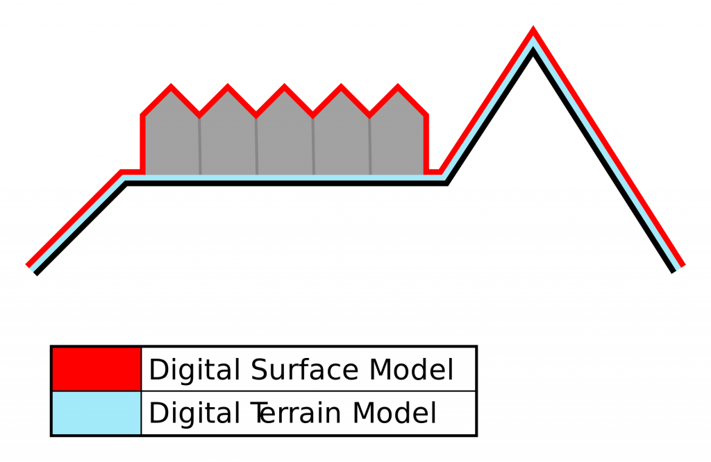
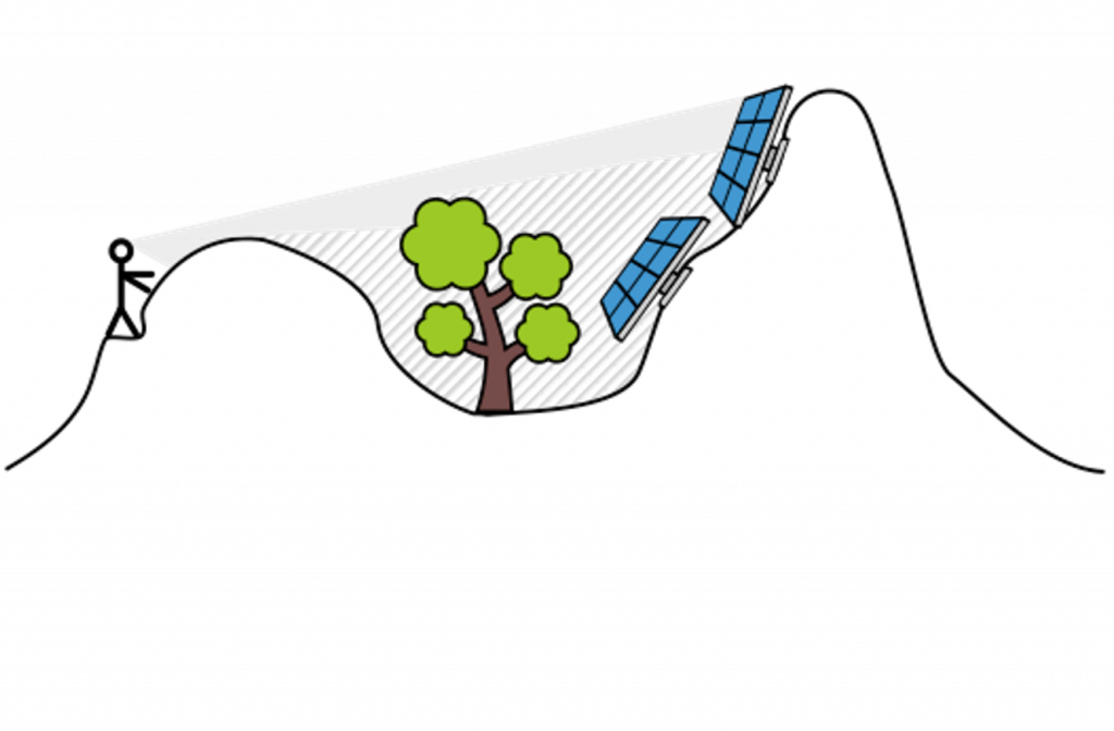
However, it requires to have access to local a Digital Surface Model (DSM) – a 3D representation of terrain elevation and overlaying objects – and to manually specify the position of all potential observation points.
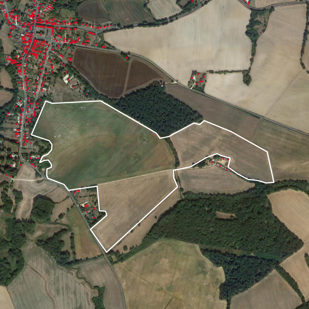
On Figure 3a below we can see two different types of elevations:
- Ground elevation (large green areas) that correspond to hills around the area of interest
- Obstacles on the ground (small hot areas) mostly due to housing and trees

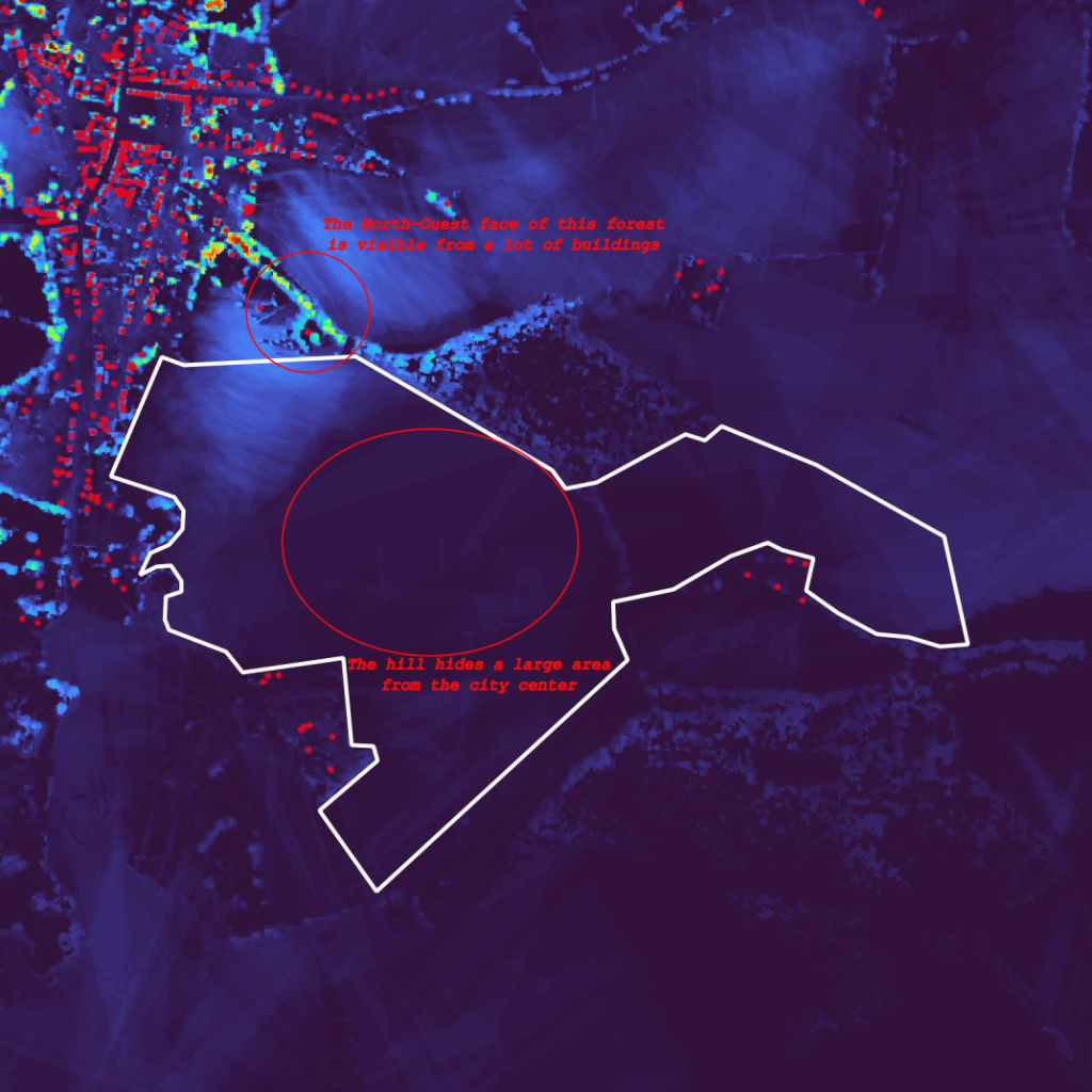
Once you’ve ran your viewshed analysis, you obtain a heatmap of areas that are visible from the surrounding viewpoints – in our case close housing buildings – as shown on Figure 4. We used QGIS for the analysis of areas visible from within 1km of every surrounding viewpoints.
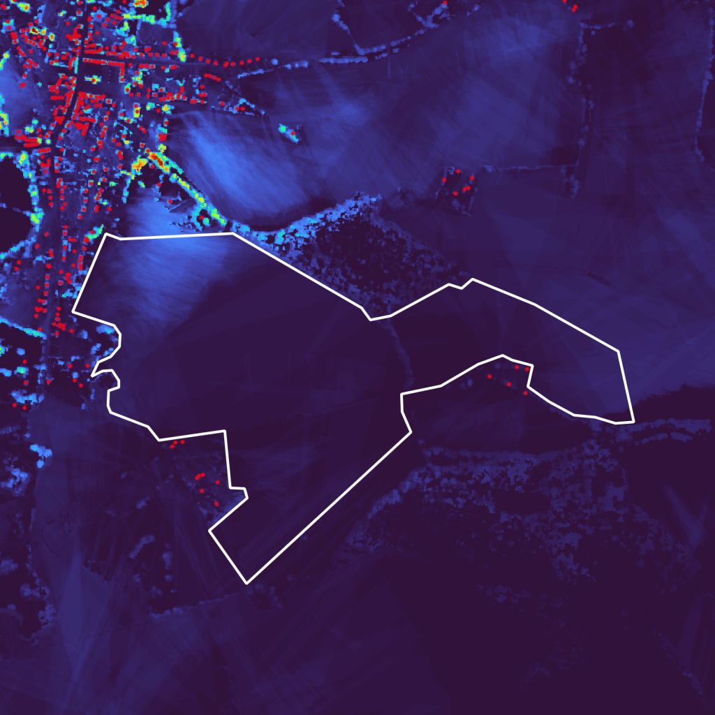
Comparing the viewshed analysis results with the DSM (Figure 5a Figure 5b), we can see that the hill in the center is obstructing the view from the building in the city center on the left, leaving a large non-visible area. Visible areas are also easily identifiable and are often areas with an important elevation (trees, buildings, etc…).

The main drawbacks of using such a tool lies in the steps you have to perform to obtain the results:
- Download the local DSM data load it into QGIS
- Manually annotate the surrounding viewpoints
- Parameterise the analysis with a lot of parameters: viewpoints elevation, visibility distance, type of analysis, etc…
- Run the analysis
- Repeat the operation every time you change a single viewpoint, the visibility distance, etc…
The Inicio prospection team can’t rely on such a method for analysing ~60 new leads per week that can be located anywhere within France territory, hence requiring the download of the whole country DSM and ~64M buildings. Also, this result is not really handy as 1km is way too much and it’s hard to infer how many viewpoints in the area are seeing each piece of area.
Challenges we faced building an automated viewshed analysis tool
Finding the right tool
The first step for building a viewshed analysis tool is having an algorithm capable of processing our data and create valuable analysis results. While we could have attempt to implement it ourselves, we decided to explore state-of-the-art tools that have been developed and maintain for several years.
GDAL – Geospatial Data Abstraction Library – is a performant piece of software for working with geospatial data. It’s an industry standard that have been providing numerous solutions for reading writing geographic data for the past 20 years. We use it on a daily basis at Inicio and are very familiar with its usage.
GDAL provides a tool for running viewshed analysis! In fact, QGIS is relying on the GDAL utility to compute viewshed analysis. The main difference is that using GDAL directly provides a near perfect integration with our existing systems and codebase, in addition to improved performances.
Finding the right data
The most important piece of the puzzle is find a reliable Digital Surface Model (DSM) dataset.
We are lucky to develop this piece of software in France because the open data ecosystem is one of the most complete and reliable in the world according to The Open Data Barometer. One of the main vendor is the French national mapping institute: IGN. They provide a lot of high quality datasets for free and a lot of augmented data. One of those is a DSM providing a LIDAR (laser-based measurement system) mapping of the apparent ground elevation of the territory, on a 50cm grid!
This type of data is called “raster” and can be visualised like pictures: It’s made of pixels that have a value equal to the ground elevation + any obstacle on the ground (Figure 2a). In our exemple, each pixel represent the value of the apparent elevation (the elevation + any obstacle on the ground) on a 50cm square tile.
While this dataset precision is top-notch, its size – 8Tb – is quite a big number. It’s equivalent to ~1400 hours (60 days) of 4K video. Its main drawback compared to a less-precise tiling are:
- Increased cost of storage Since we will need this data available for our viewshed analysis computations, we’ll have to store it on the long run.
- Increased computation time.
The following table highlights some estimations made for comparing different grid precision:

This data needs processing in order to reduce its volume and reach acceptable storage costs and computation time. One well-known operation on rasters is resampling: Instead of having a pixel every 50cm on a grid, we resample it using GDAL to obtain 5m pixels. This operation allows us to reduce the total time for computing the viewshed analysis by ~99% and the data size by ~99%.
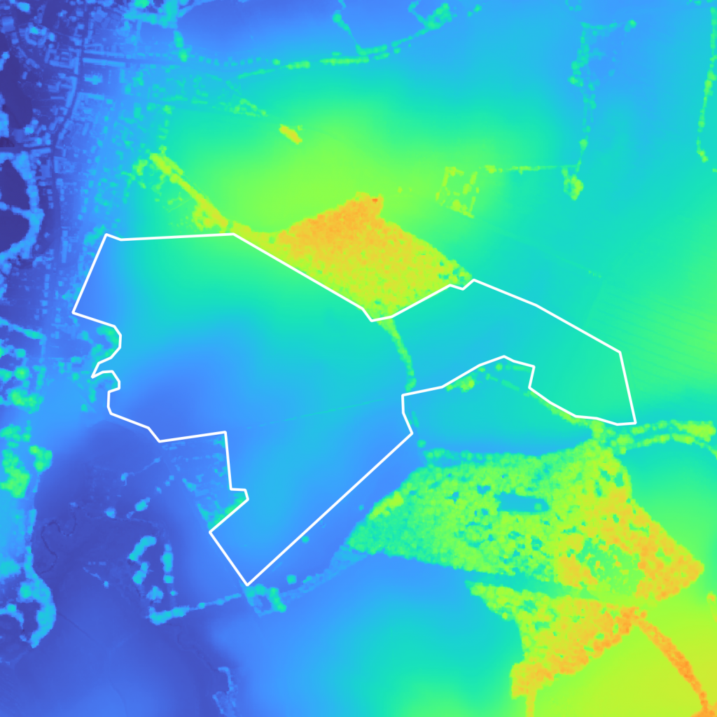

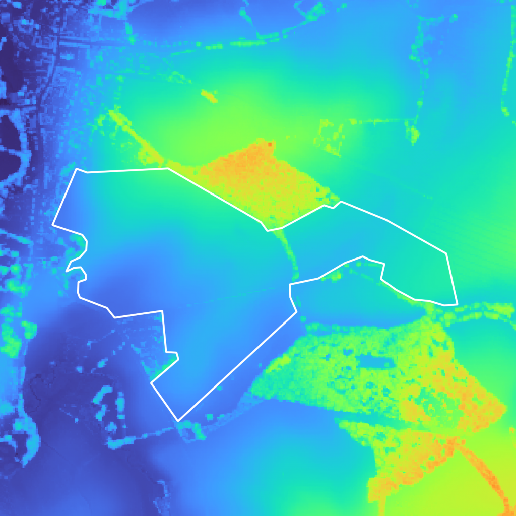
Figure 6a, Figure 6b Figure 6c are showing the comparison between the different pixel sampling sizes. Because of the size of the projects we are aiming to locate, sufficient precision is obtained by resampling our raster from 50cm pixels to 5m pixels.
Putting everything together
Having this data and those tools in hand, we’ve been able to compute and store viewshed analysis for the entire territory of France: 64M buildings and 551 695 km2 on a 5m square grid.

Figure 7 shows the main building blocks of our data ingestion and processing algorithms. Those steps are quite simple but the size of the data and complexity of the analysis made this pipeline a major challenge. We will not go into the details of how the data is stored, how it’s loaded into our algorithm, nor how our jobs were orchestrated and ran – as each one of those steps would require a dedicated article.
Our game changing, in-house solution
Humans are knowledgable
While we could’ve claimed to develop a fully automated algorithm capable of removing areas that are visible by too many viewpoints, we strongly believe that for such projects we can’t bypass human expertise. Taking every building into account and for an arbitrary distance would be too restrictive and would lead to wrong results.
Instead we chose to create a handy, super fast tool for analysing visibility areas of surrounding buildings. It enables our prospection team to draw any geometry on the ground, get all the surrounding viewpoints – within a distance they can set, and select which ones are of interest: we don’t want to analyse visible areas from farms that belong to the person that owns the land where we’ll put the future solar project – but we really care about not being visible from housing buildings. The visibility distance can also change depending on a lot of parameters. Those can only be inferred by a human.
Comparison with reality
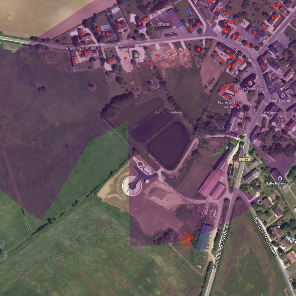
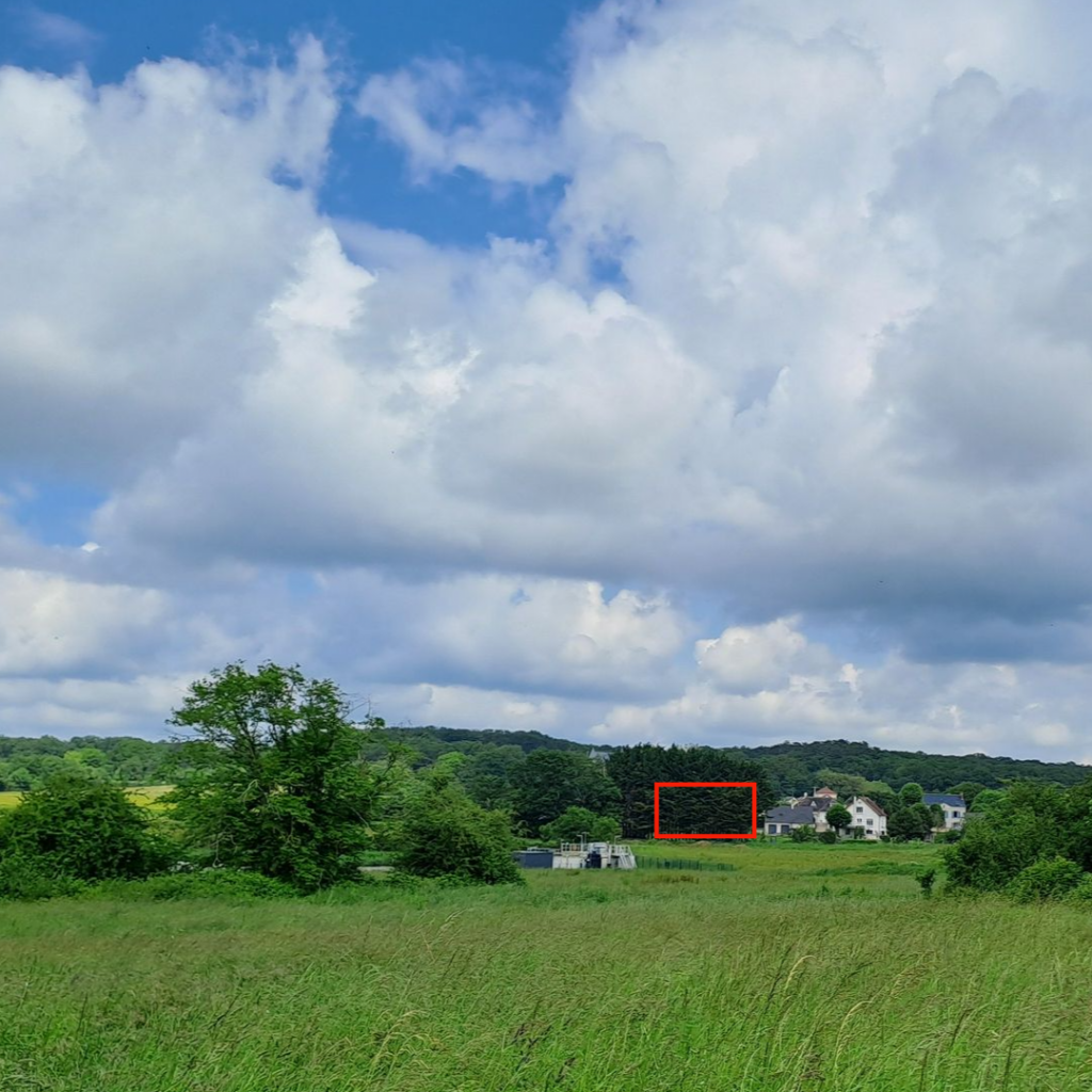
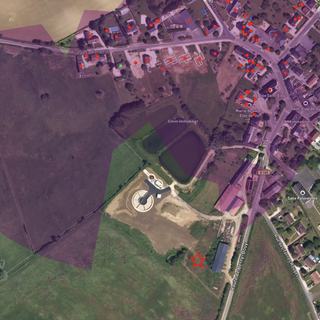
Validating our results was obviously mandatory before releasing our tool. We had to compare computed visibility areas with data collected on various places on the field. Below are a few comparison between our tool and pictures taken by our prospection team. The red rectangles on the left images are showing the building of interest while the green dot are it’s location visibility area from our tool. The red star is observer position on the field.

Where to go from here?
Our tool has greatly improved our prospection team capabilities to identify suitable Solar plant locations and is used every day at different steps in our project lifecycle. As we will grow we expect to meet stronger requirements related to data storage and analysis results precision.
This is only the first step building this tool and we can already foresee multiple improvements:
- Data storage costs and performances can be improve. L’intégration des données DSM des nouveaux pays nécessitera de revoir la manière dont nous ingérons et stockons les données. L’utilisation d’une grille de 1 mètre pourrait être nécessaire à un moment donné pour améliorer la précision de l’analyse et augmentera également la taille globale du stockage.
- Analysis can be refined to integrate finest parameterisation. Right now all buildings are treated the same way while we could distinguish their highest point of view. Visibility area is also slightly reworked for storage efficiency.
- Real-time analysis could be a great asset, allowing us to avoid storing our results, run fine-grained analyses, etc…


